
2024 · Marketplace / Retail
Moodslash
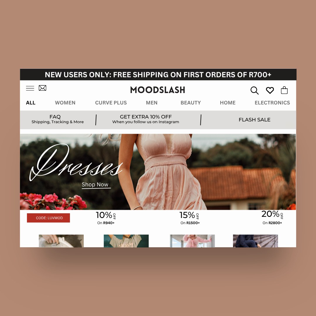
A multi-category marketplace that keeps density readable.
3 tiers
Header hierarchy
1 accent
Reserved for price actions
8 categories
Reachable in one click
The case study
How it was approached.
Context
Marketplaces live on density. Moodslash organises a promotion-heavy storefront with a strict header hierarchy so offers stay legible instead of shouty.
Challenge
Discount marketplaces get visually chaotic — every module competes and nothing reads.
Approach
A three-tier header (offer bar, category rail, utility), a fixed promotional grid, and one accent reserved for discounts only.
Outcome
A high-density storefront where the eye still knows where to land.
What it demonstrates
- Marketplace UX
- Promotional hierarchy
- Dense grid systems
Services
- E-commerce Design
- UI/UX Design
Want this for your brand?
We can adapt this thinking to your market, audience and budget. Book a 30-minute call and we'll scope it properly.
Book a Discovery CallNext project
Cocoa
Two ways to work
with Lynxio.
Need a digital solution?
Tell us what you're building.
Lynxio Studio designs, builds and automates digital systems — brand, website, app, e-commerce, CRM, support, sales and AI — as one engagement.
Run a service business?
Run your business from one connected workspace.
Lynxio Hub gives agencies, studios, consultants and freelancers CRM, projects, a client portal, invoicing, meetings and outreach in one platform.
Hub is a separate application at hub.lynxiostudio.com. Sign in to Hub